CSS 스타일, 속성 - 플렉스 레이아웃
플렉스 레이아웃
: 그리드 레이아웃을 기본으로 플렉스박스를 원하는 위치에 배치하는것.
<style type="text/css">
.wrapper{
display: -webkit-box; /* ios 6이하 , 사파리 3.1*/
display: -moz-box; /* 파이어 폭스 19이하 */
display: -ms-flexbox; /* IE 10 */
display: -webkit-flex; /*웹킷 구버전*/
display: flex; /* 표준 스펙 */
}
#container1 {
width:500px;
height:300px;
margin:0 auto;
display:flex;
border:2px solid black;
}
#container1 div {
width:200px;
border: 2px solid black;
background:#ccc;
}
#container2 {
width: 500px;
height: 300px;
margin: 0 auto;
display: flex;
flex-direction: row-reverse;
border: 2px solid black;
}
#container2 div {
width: 200px;
border: 1px solid black;
background: #ccc;
}
h2 {
font-size:20px;
font-weight:bold;
padding:20px;
}
#container3 {
width: 500px;
height: 300px;
margin: 0 auto;
display: flex;
-ms-flex-wrap: wrap-reverse;
-webkit-flex-wrap: wrap-reverse;
flex-wrap: wrap-reverse;
border: 2px solid black;
}
#container3 div {
width:200px;
border: 2px solid black;
background:#ccc;
}
#container4 {
width: 500px;
height: 300px;
margin: 0 auto;
display: flex;
-ms-flex-wrap: wrap;
-webkit-flex-wrap: wrap;
flex-wrap: wrap;
border: 2px solid black;
}
#container4 div {
width:200px;
border: 2px solid black;
background:#ccc;
}
#container5 {
width:500px;
height:300px;
margin:0 auto;
display:flex;
border:2px solid black;
}
#container5 div {
width:200px;
border: 2px solid black;
background:#ccc;
}
#box1 {
order:1;
}
#box2 {
order:2;
}
#box3 {
order:3;
}
#container6 {
width: 500px;
height: 100px;
margin: 0 auto 20px;
display: flex;
align-items:center;
border: 2px solid black;
}
#container6 div {
width:100px;
height:50px;
border: 2px solid black;
background:#ccc;
}
#box4 {
-ms-flex: 1 1 0;
-webkit-flex: 1 1 0;
flex: 1 1 0;
}
#box5 {
-ms-flex: 2 2 0;
-webkit-flex: 2 2 0;
flex: 2 2 0; /* 2배 늘이거나 2배 줄입 */
}
h1 {
text-align:center;
}
p {
font-weight:bold;
text-align:center;
font-weight:bold;
}
.wrapper1 {
width: 500px;
height: 50px;
margin: 0 auto 20px;
display: flex;
border: 2px solid black;
}
#container7 {
justify-content:flex-start;
}
#container8 {
justify-content: flex-end;
}
#container9 {
justify-content: center;
}
#container10 {
justify-content: space-between;
}
#container11 {
justify-content: space-around;
}
.wrapper1 div {
width:100px;
border: 2px solid black;
background:#ccc;
}
.wrapper2 {
width: 500px;
height: 100px;
margin: 0 auto 20px;
display: flex;
border: 2px solid black;
}
#container12 {
align-items: stretch;
}
#container13 {
align-items:flex-start;
}
#container14 {
align-items: flex-end;
}
#container15 {
align-items: center;
}
#container16 {
align-items: baseline;
}
.wrapper2 div {
width:100px;
border: 2px solid black;
background:#ccc;
}
#container17 {
width: 500px;
height: 100px;
margin: 0 auto 20px;
display: flex;
align-items:center;
border: 2px solid black;
}
#container17 div {
width:100px;
border: 2px solid black;
background:#ccc;
}
#box6 {
align-self:flex-start;
}
.wrapper3 {
width: 500px;
height: 150px;
margin: 0 auto 20px;
display: flex;
-ms-flex-wrap: wrap;
-webkit-flex-wrap: wrap;
flex-wrap: wrap;
border: 2px solid black;
}
#container18 {
-ms-align-content: flex-start;
-webkit-align-content: flex-start;
align-content: flex-start;
}
#container19 {
-ms-align-content: flex-end;
-webkit-align-content: flex-end;
align-content: flex-end;
}
#container20 {
-ms-align-content: center;
-webkit-align-content: center;
align-content: center;
}
#container21 {
-ms-align-content: space-between;
-webkit-align-content: space-between;
align-content: space-between;
}
#container22 {
-ms-align-content: space-around;
-webkit-align-content: space-around;
align-content: space-around;
}
.wrapper3 div {
width:200px;
border: 2px solid black;
background:#ccc;
}
</style>
<meta charset="UTF-8">
<title>Document</title>
</head>
<body>
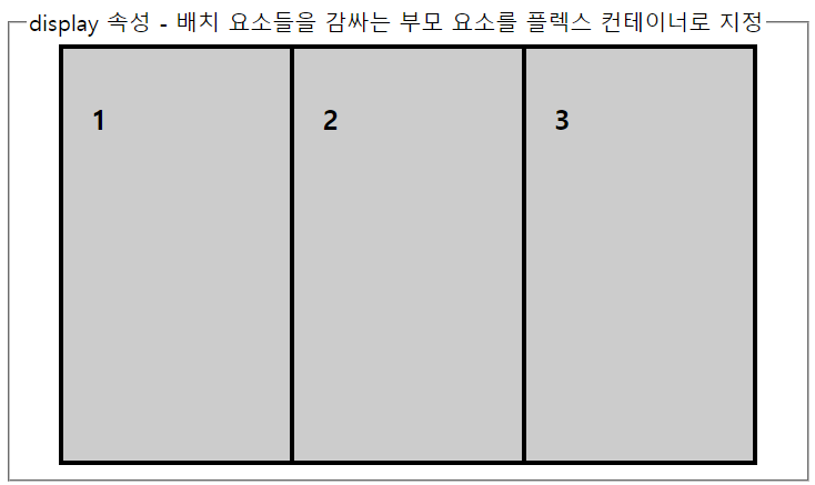
display
: 배치 요소들을 감싸는 부모 요소를 플렉스 컨테이너로 지정
display : flex | inline-flex
flex - 플렉스 박스를 박스레벨 요소로 정의
inline-flex : 플렉스박스를 인라인 레벨요소로 정의
display 속성과 브라우저 접두사
- 최신 모던 브라우저는 모두 지원 된다
- 하지만 브라우저마다 플렉스 박스 지원을 하는방법이 달라 브라우저 접두사를 붙여야 한다
display: -webkit-box; /* ios 6이하 , 사파리 3.1*/
display: -moz-box; /* 파이어 폭스 19이하 */
display: -ms-flexbox; /* IE 10 */
display: -webkit-flex; /*웹킷 구버전*/
display: flex; /* 표준 스펙 */
ex.
<fieldset>
<legend>display 속성 - 배치 요소들을 감싸는 부모 요소를 플렉스 컨테이너로 지정</legend>
<div id="container1">
<div id="box1"><h2>1</h2></div>
<div id="box2"><h2>2</h2></div>
<div id="box3"><h2>3</h2></div>
</div>
</fieldset>
출력화면
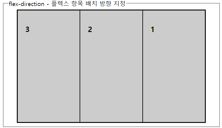
flex-direction
: 플렉스 항목 배치 방향 지정
flex-direction: row | row-reverse | column | column-reverse
row - 왼쪽에서 오른쪽
row-reverse - 오른쪽에서 왼쪽
column - 위쪽에서 아래쪽
column-reverse - 아래쪽에서 위쪽
ex.
<fieldset>
<legend>flex-direction - 플렉스 항목 배치 방향 지정</legend>
<div id="container2">
<div id="box1"><h2>1</h2></div>
<div id="box2"><h2>2</h2></div>
<div id="box3"><h2>3</h2></div>
</div>
</fieldset>
출력화면
flex-wrap
: 플렉스 항목을 한줄또는 여러줄로 배치
flex-wrap : no-wrap | wrap | wrap-reverse
no-wrap - 한줄에 표시한다 기본값
wrap - 여러줄에 표시한다.
wrap-reverse - 여러줄에 표시하되 기존방향과 반대로 배치
ex.
<fieldset>
<legend>flex-wrap - 플렉스 항목을 한줄또는 여러줄로 배치</legend>
<div id="container3">
<div id="box1"><h2>1</h2></div>
<div id="box2"><h2>2</h2></div>
<div id="box3"><h2>3</h2></div>
</div>
<div id="container4">
<div id="box1"><h2>1</h2></div>
<div id="box2"><h2>2</h2></div>
<div id="box3"><h2>3</h2></div>
</div>
</fieldset>
출력화면

flex-flow
: 플랙스 배치방향과 여러줄 배치를 한꺼번에 지정
flex-flow : 플렉스방향 플렉스줄배치
기본값은 flex-flow: row no-wrap;
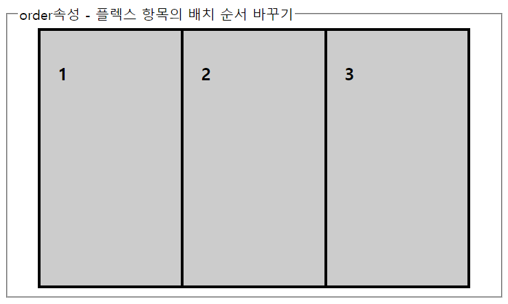
order
: 플렉스 항목의 배치 순서 바꾸기
order값에 지정된 순서에 따라 배치된다
ex.
<fieldset>
<legend>order속성 - 플렉스 항목의 배치 순서 바꾸기</legend>
<div id="container5">
<div id="box1"><h2>1</h2></div>
<div id="box2"><h2>2</h2></div>
<div id="box3"><h2>3</h2></div>
</div>
</fieldset>
출력화면
flex
: 플렉스 항목의 크기 조절
flex-grow와 flex-shrink , flex-vasis 속성은 별개의 속성이지만 따로 쓰지않고 flex속성과 묶어서 사용
flex: [flex-grow , flex-shrink , flex-vasis] | auto | initial
flex-grow : 항목의 너비를 얼마나 늘일지 숫자로 지정
flex-shrink : 항목의 너비를 얼마나 줄일지 숫자로 지정.
flex-vasis : 항목의 기본크기를 지정. 0일경우 flex-grow , flex-shrink 인수값을 함께 사용 / auto일경우 플렉스 항목의 너비값을 사용
initial : 항목의 width / height 값에 의해 크기가 결정 ; 플렉스 컨테이너의 공간이 부족한 경우 최소 크기까지 줄인다
auto : 항목의 width / height 값에 의해 크기가 결정 ; 플렉스 컨테이너의 공간에 따라 달라진다
ex.
<fieldset>
<legend>flex 속성 - 플렉스 항목의 크기 조절</legend>
<div id="container6">
<div id="box4"><p>1</p></div>
<div id="box5"><p>2</p></div>
<div id="box4"><p>3</p></div>
</div>
</fieldset>
출력화면

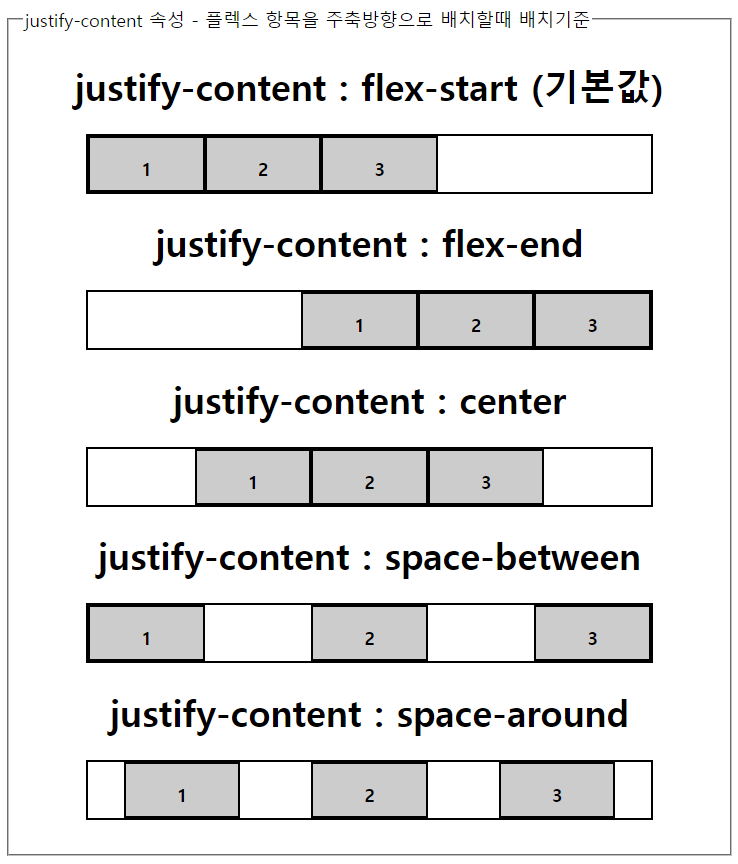
justify-content
: 플렉스 항목을 주축방향으로 배치할때 배치기준
justify-content: flex-start | flex-end | center | space-between | space around
flex-start : 주축의 시작점 기준
flex-end : 주축의 끝을 기준
center : 중앙 기준
space-between : 처음과 끝에 배치하고 중앙항목은 같은 간격으로 배치
space-around : 모든 플렉스 항목들을 같은 간격으로 배치
ex.
<fieldset>
<legend>justify-content 속성 - 플렉스 항목을 주축방향으로 배치할때 배치기준</legend>
<h1>justify-content : flex-start (기본값)</h1>
<div id="container7" class="wrapper1">
<div><p>1</p></div>
<div><p>2</p></div>
<div><p>3</p></div>
</div>
<h1>justify-content : flex-end</h1>
<div id="container8" class="wrapper1">
<div><p>1</p></div>
<div><p>2</p></div>
<div><p>3</p></div>
</div>
<h1>justify-content : center</h1>
<div id="container9" class="wrapper1">
<div><p>1</p></div>
<div><p>2</p></div>
<div><p>3</p></div>
</div>
<h1>justify-content : space-between</h1>
<div id="container10" class="wrapper1">
<div><p>1</p></div>
<div><p>2</p></div>
<div><p>3</p></div>
</div>
<h1>justify-content : space-around</h1>
<div id="container11" class="wrapper1">
<div><p>1</p></div>
<div><p>2</p></div>
<div><p>3</p></div>
</div>
</fieldset>
출력화면
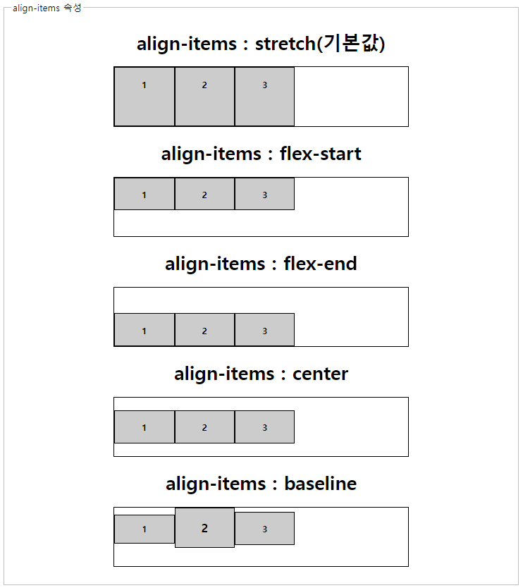
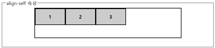
align-items / align-self
: 교차축을 기준으로 하는 배치 방법
align-items: stretch | flex-start | flex-end | center | baseline
align-self: auto | stretch | flex-start | flex-end | center | baseline
stretch : 플렉스 항목을 확장해 교차축을 꽉 채운다 (기본값)
flex-start : 주축의 시작점 기준
flex-end : 주축의 끝을 기준
center : 중앙 기준
baseline : 시작점과 글자 기준선이 가장 먼플렉스 항목을 시작점에 배치, 그리고 그 글자의 기준선과 다른항목의 기준선을 맞춰 배치
ex.
<fieldset>
<legend>align-items 속성</legend>
<h1>align-items : stretch(기본값)</h1>
<div id="container12" class="wrapper2">
<div><p>1</p></div>
<div><p>2</p></div>
<div><p>3</p></div>
</div>
<h1>align-items : flex-start</h1>
<div id="container13" class="wrapper2">
<div><p>1</p></div>
<div><p>2</p></div>
<div><p>3</p></div>
</div>
<h1>align-items : flex-end</h1>
<div id="container14" class="wrapper2">
<div><p>1</p></div>
<div><p>2</p></div>
<div><p>3</p></div>
</div>
<h1>align-items : center</h1>
<div id="container15" class="wrapper2">
<div><p>1</p></div>
<div><p>2</p></div>
<div><p>3</p></div>
</div>
<h1>align-items : baseline</h1>
<div id="container16" class="wrapper2">
<div><p style="font-size:14px">1</p></div>
<div><p style="font-size:20px">2</p></div>
<div><p style="font-size:16px">3</p></div>
</div>
</fieldset>
출력화면
<fieldset>
<legend>align-self 속성</legend>
<div id="container17">
<div id="box6"><p>1</p></div>
<div id="box6"><p>2</p></div>
<div id="box6"><p>3</p></div>
</div>
</fieldset>
출력화면
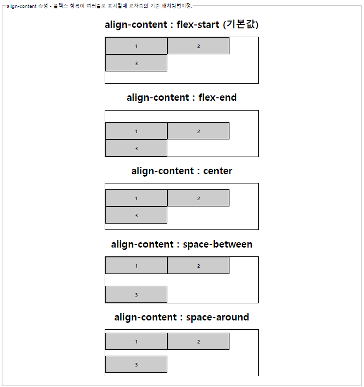
align-content
: 플렉스 항목이 여러줄로 표시될때 교차축의 기준 배치방법지정.
align-content : flex-start | flex-end | center | space-between | space around
flex-start : 주축의 시작점 기준
flex-end : 주축의 끝을 기준
center : 중앙 기준
space-between : 처음과 끝에 배치하고 중앙항목은 같은 간격으로 배치
space-around : 모든 플렉스 항목들을 같은 간격으로 배치
ex.
<fieldset>
<legend>align-content 속성 - 플렉스 항목이 여러줄로 표시될때 교차축의 기준 배치방법지정.</legend>
<h1>align-content : flex-start (기본값)</h1>
<div id="container18" class="wrapper3">
<div><p>1</p></div>
<div><p>2</p></div>
<div><p>3</p></div>
</div>
<h1>align-content : flex-end</h1>
<div id="container19" class="wrapper3">
<div><p>1</p></div>
<div><p>2</p></div>
<div><p>3</p></div>
</div>
<h1>align-content : center</h1>
<div id="container20" class="wrapper3">
<div><p>1</p></div>
<div><p>2</p></div>
<div><p>3</p></div>
</div>
<h1>align-content : space-between</h1>
<div id="container21" class="wrapper3">
<div><p>1</p></div>
<div><p>2</p></div>
<div><p>3</p></div>
</div>
<h1>align-content : space-around</h1>
<div id="container22" class="wrapper3">
<div><p>1</p></div>
<div><p>2</p></div>
<div><p>3</p></div>
</div>
</fieldset>
출력화면
'Backend > HTML, CSS' 카테고리의 다른 글
| CSS 부트스트랩 bootstrap 프론트엔드 툴 사용하기 - 세팅 및 적용 (0) | 2023.05.03 |
|---|---|
| CSS 스타일, 속성 - 캡션, 셀, 정렬 (0) | 2023.05.03 |
| CSS 스타일, 속성 - CSS Positioning (0) | 2023.05.03 |
| CSS 스타일, 속성 - 패딩 padding, 마진 margin (0) | 2023.05.03 |
| CSS 스타일, 속성 - 테두리, 두께, 색상, 그림자 효과 (0) | 2023.05.03 |